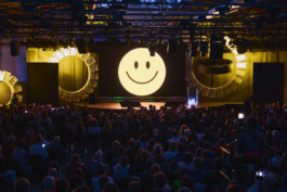
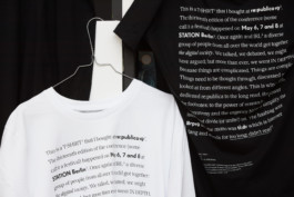
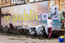
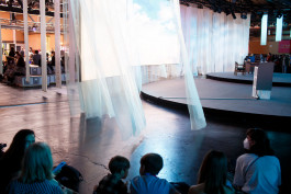
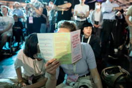
We've known each other for so long – reinventing the wheel for re:publica 2026
→ View project

An austere framework for a generous content machine: The new website for Herzog & de Meuron.
→ View project
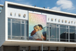
Artwork for Germany's next love story »Allegro Pastell«
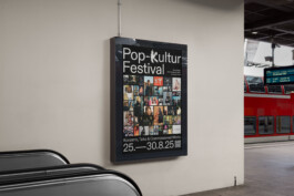
Supernormal poster campaign for Pop-Kultur Festival 2025
→ View project
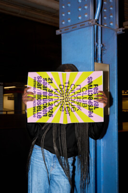
A fresh perspective on genre-blending Festival Perspectives in and around Saarbrücken
→ View project
Muscle-flexing visual identity for The Gym, a hybrid event between art, training and performance in Vienna.
→ View project

We've designed the logo and visual identity of Musicboard Berlin, the city's most notable insitution in music funding. → View project
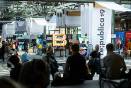
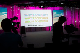
Cashing in on neon colors and bold typography at re:publica 23
→ View project


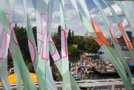
Our posters for Pop-Kultur Festival orderly mushrooming in the streets of Berlin. Featuring fungi photography by Hansepilz.

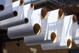
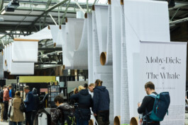
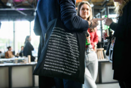
Text-heavy visual identity and event design for re:publica 2019 including a 450m long installation of Moby Dick. The motto was tl;dr – internet slang for "too long; didn't read".
→ View project


Riso-printed brickwork for gegen\archive – an exhibition by Prater Galerie Berlin.
→ View project
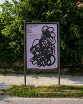
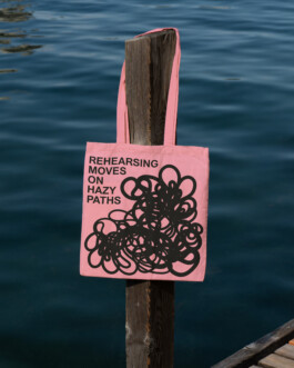
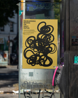
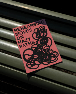
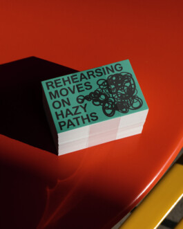
Meandering lines on solid colours for participatory summer series »Rehearsing Moves on Hazy Paths«.

Light-flooded identity and modular webdesign for Kultur Räume Berlin — a newly founded alliance creating, protecting and brokering spaces for the arts in Berlin.
Editorial design for »Please Come«, a 536-page brick of a book around Berlin-based DYI concert promoter Shameless/Limitless. Published by slanted, more info here.

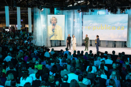
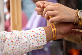
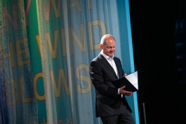
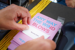
Karaoke-inspired visual identity and event design for re:publica's 2022 conference titled »Any way the wind blows«.
Expanding visual identity for 24h Europe, an expansive 24-hour long TV documentary presented on arte.
→ View project
Coexistential design for Art in Public Space Tyrol 2021.
→ View project


Latest drop: Visual identity for Fossile Erfahrung at Großer Wasserspeicher Berlin.

Resetting global power politics – Visual identity, logo and naming for the first Future Affairs Conference at the German Foreign Office in Berlin.
→ View project
Visual identity for »A Better Version of You» – an art show disguised as a tech fair.
→ View project

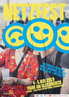
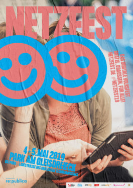
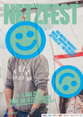
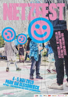
Campaigning for Netzfest we've covered everyone's faces with smileys to broach the issue of privacy and data protection (and to make them look extremely happy).
→ View project

In 2016 we designed our first visual identity for re:publica. It was the 10th anniversary of Europe's biggest conference on internet and society. The motto was »TEN« and we reflected the three letters so they became NET. Since then we've been responsible for all further editions of the festival.
→ View project

*Awarded by the German Design Council
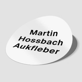
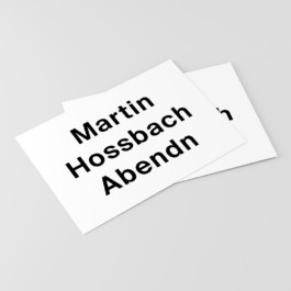
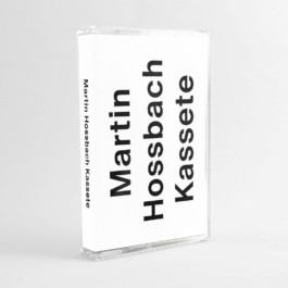
For our friend's record label »Martin Hossbach« we designed an orthographically careless visual identity. Martin has a very precise mind and he hates spellign mistakes.

Cutting-edge logo for Marie Antoinette Club, Berlin.
»The Disappeared« is a film about a film that was censored by the Israeli army. We made a poster censoring the original poster.

A long time ago we designed a logo for AIAS – International Association of Independent Art and Design Schools
This is an image from our campaign in support of organ donation. You get the joke.


The motto of re:publica 17 was »Love Out Loud«. We staged a colorful love protest across both digital and hand-made forms of expression, for example crafting protest signs with cnc milling machines.
→ View project
In 2017 we designed the visual identity of Pop-Kultur Festival. The concept was developed by British artist Scott King.
→ View project

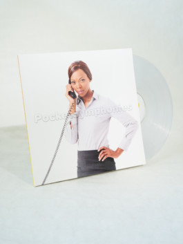
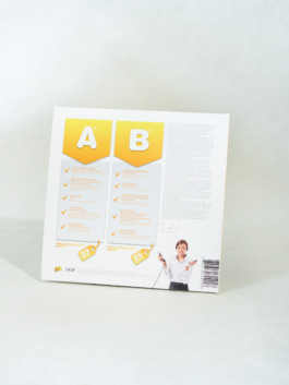
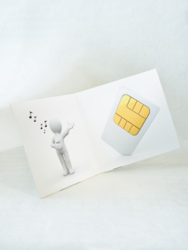
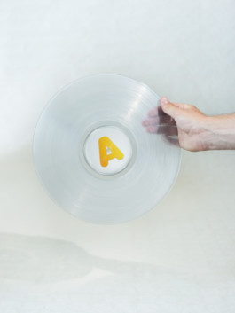
This is a record sleeve we created for HKW Haus der Kulturen der Welt / Martin Hossbach. The record contains experimental interpretations of the commercial jingle of Deutsche Telekom. Da-da-da-da-daaaa.
Logo design and visual identity for Budde Music Publishing based on a previous design of the company which was abandoned in the 1980s.


Poster for an exhibition by photographers Johann Clausen and Alexander Graeser commissioned by Goethe-Institut Beirut.
